I read Entertainment Weekly's website daily. They do a great job of covering the big stuff, uncovering little niblets of random awesomeness, and using writers who feel like they have a personality instead of being journalistic info-bots regurgitating information that the sponsors paid to have fed to the public. On their page the other day was an article about the latest movie poster by a design house called Mondo. It was so visually striking that it actually made me want to see former Mousketeer Ryan Gosling's movie, Drive after months of not caring a lick. The write-up also mentioned that the company is an off-shoot of the Alamo Drafthouse cinema chain, which was elevated to hero status in my book for their strict no talking or texting during the movie policy. Check out this amazeballs commercial that they made. I still laugh every time I watch it. Bless them. (Warning: this video is not suitable for work or for little ears. Unless you work with tiny elves who swear like sailors. Then it's fine for both.)
The video went viral and, while there for a screening of their movie Young Adult, director Jason Reitman and actor Patton Oswalt, who was the voice of Ratatouille, made this companion piece. (Warning: still has wordy dirds.)
This all led me to go to the Mondo website and check out some of their other poster art. I promptly fell down a internet rabbit hole consisting of some of the most ingenious movie advertising artwork I had ever seen. Now, from what I can glean, these are not official movie posters, but rather artwork sanctioned by studios and used for runs at the Alamo Drafthouse and (rightly) sold to collectors as legitimate pieces of art. I was stunned. They are able to really get to the heartmeat of a movie in a very visceral way with just one single image. They make me want to go to movies I've never seen and make me look at ones that I have in a new light. Different artists are employed and they each bring their own unique talents to the projects. Stylistically they range from Art Deco and Nouveau to classic Hollywood to comic book to children's book illustrations, each using a specific style to highlight an aspect of the film being touted. Suffice it to say that it's very hard for me to pick a favorite. They are pretty much all impeccable.
Here is their take on some of the early animated classics. They are very youth-friendly without pandering to children with loud colors and/or insulting over-simplicity.


They've also taken a crack at some classic animated shorts. They all capture the time period of the twenties and thirties beautifully in their styling. They are playful, staying true to the Disney look while not being slavish to it.


Here is their only Pixar offering so far and it's for my personal favorite, Monsters Inc.! I love that there is a graphic simplicity that looks very modern but very classic at the same time, yet it is also packed with fantastic details, like the supporting characters on the bottom. (Tell me how long it took you to spot Randall. Wait, really? That's all? Well, now I feel dumb...) It also manages to perfectly capture the dynamic between worry-wart Mike, care-free Sully and astonished Boo in an instant.

Here we have Who Framed Roger Rabbit? It's amazing to me that they can give two films as different as this and Monster Inc. artwork that looks like it could be part of a related series while still retaining their own individuality. Great, great artistry on display here.

Here is their first and only (for now) Studio Ghibli poster for My Neighbor Totoro. I haven't seen this film yet, but I will say that this makes me eager to get around to it.

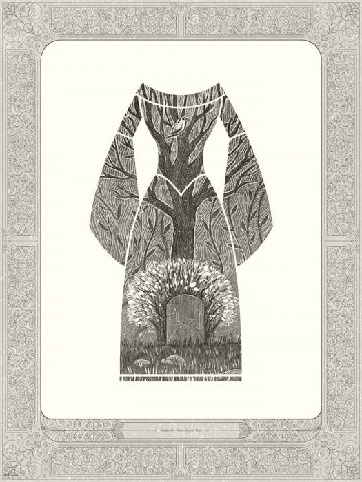
ABC commissioned a series of pieces for their storybook centered TV show Once Upon A Time (which Tom and I have become big fans of, by the by). Each one represents on of the tales that intertwine throughout the series. In a very classic, clean, inventive and hand-crafted way they invoke the stories of (in the order they are shown below) Cinderella, Little Red Riding Hood, Rapunzel, Rumpelstiltskin, Sleeping Beauty and Snow White. These look like they could be illustrative plates in a high-end edition of a book of fairy tales. I love them. Not to mention they pique my interest regarding characters that have yet to show up. Something to look forward to!


The first Disney film that they approached was Tron, which is fitting since most of their early offerings tends towards more science fiction movies and movies with cult followings, which are both groups Tron fits into comfortably. I love it. It evokes the original designs, adding a bit of a comic book sensibility and bursts of exciting color while depicting the thrill of the light cycle race scene.

When Tron: Legacy was released in theaters and both it and the original were released on Blu-ray, it gave Mondo an opportunity to revisit the films and it did so with two pairs of related posters. The first is a diptych, creating two halves of one whole and the second is strongly linked by it design and stylistic similarities. Both sets are rad.


Seeing this stuff makes me wonder why studios aren't lining up to get Mondo to do their actual poster art in droves. Disney itself is a bit hit-or-miss on the promotional artwork front, but is still more adventurous than many studios. Hopefully the fact that they have taken notice and given their blessing to Mondo bodes well for a bolder approach for them. My guess, though, is that it doesn't, unfortunately. We are just going to have to be satisfied for now that someone is lavishing this incredible artwork on the studio since they aren't doing it themselves. Can you imagine if they had let Mondo design their Diamond line covers? My heart would melt! I would even love to see what they would do with the less celebrated Disney titles and live action movies. I bet they would have a field day with back catalog films like Freaky Friday or Home on the Range and, if the studio widely used the art, it would show fans that the studio is investing in the aesthetic future of the company.
Do yourself a favor and take some time to explore their gallery of artwork. Their posters span blockbusters and indies, horror and family films, and they have almost certainly made one for a least a few of your favorites. The also have a store where you can purchase items such as prints and t-shirts for selected designs, including some with the Disney artwork. The prices are reasonable, especially for the limited edition prints that would look amazing framed. If you are looking to buy me a present, I am especially partial to "The Wise Little Hen" and "Steamboat Willie". Just putting that out there. Winky face. What are some of your faves? (Besides the Disney titles I love their posters for Trick'r'Treat and The Iron Giant among many, many others.) I'd love to hear what you think of their art and what you think about how Disney is currently doing with their own promotional art. Gimme a holler!
Do yourself a favor and take some time to explore their gallery of artwork. Their posters span blockbusters and indies, horror and family films, and they have almost certainly made one for a least a few of your favorites. The also have a store where you can purchase items such as prints and t-shirts for selected designs, including some with the Disney artwork. The prices are reasonable, especially for the limited edition prints that would look amazing framed. If you are looking to buy me a present, I am especially partial to "The Wise Little Hen" and "Steamboat Willie". Just putting that out there. Winky face. What are some of your faves? (Besides the Disney titles I love their posters for Trick'r'Treat and The Iron Giant among many, many others.) I'd love to hear what you think of their art and what you think about how Disney is currently doing with their own promotional art. Gimme a holler!
I just found your blog, and would really like to send you an e-mail. My email is gbcmem@gmail.com. We have a LOT in common. don't worry, I'm not psycho. LOL
ReplyDeleteGalen